
Header
Properties | Events | Methods
Defines the configuration options for the header sections, items, background color, and font color.
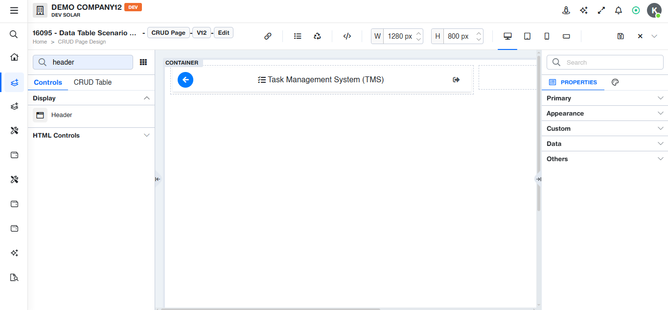
Properties
Custom
Options
Defines the configuration options for the header sections, items, background color, and font color.
Background Color
Defines the background color of the header bar.
Font
Defines the font color of the header bar.
Name / Label
Defines the header icon or button header. It is also used as the alternative text or tooltip when a tooltip is not provided.
Section
Defines the alignment of the header section as left, center, or right.
Render Type
Defines the display format of the header item, such as icon, text, icon with text, or button.
Order No
Defines the display order of the item within its section.
Tooltip
Defines the tooltip text displayed when hovering over the header item.
Color
Defines the inline text color for a specific header item.
Background Color
Defines the inline background color for a specific header item.
CSS Class
Defines an additional CSS class to be applied to the header item.
Disable this Item
Defines whether the header item is enabled or disabled.
Hide this Item
Defines whether the header item is shown or hidden.
Style Object
Defines inline styling properties for the header item.
Screen Type
Defines the target type for drilldown navigation, such as Screen, Report, Dashboard, Task, Static, or Print Document.
Navigation
Defines the screen number used as the navigation target.
Open Type
Defines the opening mode for the drilldown: New Tab, Popup, or None.
Events
Applied Event is onClick
Methods
No methods are specified.